
I built my own calorie tracker
I quit food tracking at a café table in Paris, with a salad going warm in front of me and my phone in my hand.
It was the house salad, the one with no name on the menu beyond salade du jour: warm goat's cheese on toasted baguette, walnuts, figs, a honey dressing, over whatever leaves they had that morning. I'd opened the app to log it. I searched "goat cheese salad." Sixty results came back — three American restaurant chains, a supermarket packet, and a long tail of user-submitted entries with names like "Goat Cheese Salad (homemade)" and "goat cheese salad 1 cup" that disagreed with each other by three hundred calories. Then the app asked me to pick a portion size, offering "1 serving" without telling me what a serving was.
I sat there in one of the nicest cities in the world, decomposing my lunch into a stranger's database rows, while it got cold. Then I put the phone down and ate it.
That was day nine. I never opened the app again.
The frustrating part is that I wasn't missing any information. I knew exactly what I'd eaten — I could have written it on the back of the receipt in five seconds. The app wasn't asking me a question I couldn't answer. It was asking me to translate something I already knew into a format its database could store, and its database had no room for a salad that existed only that morning, in that café.
So I built the version that skips the translation. It's called numnum, and the whole pitch is on the login screen:
No searching, no scanning, no portion pickers. A sentence is enough.
What it is
numnum is a food journal you install on your phone. It opens on today.
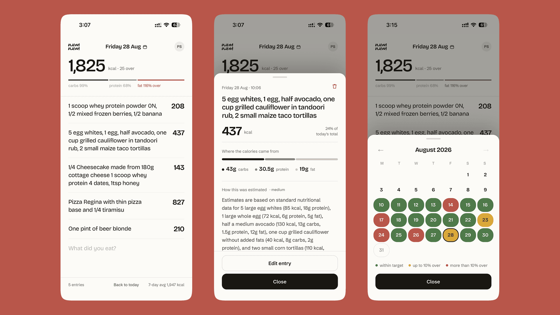
You type what you ate, in your own words, on the next empty line. "Goat cheese salad with walnuts, figs and honey dressing." You hit enter. The line is yours immediately, and a moment later the numbers show up next to it.
That's the app. Everything else is in service of that one gesture.
There's a day view with your calorie total and three thin bars for carbs, protein and fat. You swipe sideways to move between days. There's a calendar where every day you've logged is tinted green, amber or red depending on how you did against your target. There's a settings screen where you set those targets. That's the complete feature list.
What I deliberately didn't build
Before I wrote any code I wrote a short spec, and the section I keep coming back to isn't the requirements. It's the non-goals: no progress dashboard, no trend analytics, no coaching, no streaks, no social feed, no meal planning.
Every one of those was tempting. Streaks especially — they're cheap to build and they demonstrably work. But they work by making you feel bad, and an app that makes you feel bad about food is the opposite of what I wanted sitting on my home screen. A weekly trend chart would have been genuinely useful and I still cut it, because the moment there's a dashboard there's a reason to open the app that isn't writing in it, and then I'm designing for the wrong visit.
I gave myself one number as a concession to the analytics instinct: a seven-day average, in small grey type, in the footer. It's there when you look for it and invisible when you don't.
A journal you actually write in beats an analytics platform you abandon after nine days. I have firsthand evidence.
The design
The metaphor is a paper notebook, and I wanted it carried all the way down rather than painted on top.
Practically, that meant naming things after physical objects instead of interface roles. The palette is ink, paper, moss, clay, stone, pebble. That sounds like a cosmetic decision, but it changed how I made choices further down. When you go over your calorie target, the bar turns clay — a muted brick red, the colour of a correction in the margin. If I'd called that colour "destructive" I'd have reached for something louder and more alarming, which is exactly the wrong emotional register for you ate a bit more than you planned.
There's no dark mode, and that's a decision rather than an omission. Notebooks don't have one. Building it would have meant maintaining a second palette to make the app feel less like the thing it's imitating.
The typography does most of the work. The day's calorie total is set enormous, in a warm grotesque with the letter-spacing pulled tight — it's the one thing you open the app to see, so it's the one thing you can't miss. Everything else on the screen is quiet by comparison.
The input isn't a form field. It has no border, no placeholder box, no submit button sitting next to it. It's the next empty line on the page, and it stays focused after you write so you can keep going. Logging three things in a row feels like writing a list, because it is one.
And the words hold the metaphor too. You don't sign in, you "open my notebook." While the estimate is being worked out, the app says it's "working out the numbers." Tap an entry and the sections are headed "Where the calories came from" and "How this was estimated." None of that is clever for its own sake. It's the voice a notebook would use, and staying in it is most of what makes a small app feel like somebody made it on purpose.
Three things I cared about getting right
Changing days should feel like a physical thing. On a screen whose entire job is which day am I looking at, swiping between days isn't navigation chrome, it's the main interaction. So it works like a deck of cards rather than a slideshow: yesterday lies face-up underneath today, tomorrow waits just off the right edge. You drag the top card and the one beneath is genuinely there — the app quietly loads the neighbouring days before you ask for them, so what appears under your thumb is a real day with real entries, not a grey placeholder that fills in a second later. If you let go halfway, it carries on from exactly where your finger left rather than snapping back to the start.
This is the part of the app I rebuilt the most times, by a distance. That felt disproportionate while I was doing it. It isn't. It's the thing people touch most.
The estimate has to be checkable. An app that invents your calorie numbers is worse than no app at all, because you'll believe it. So numnum doesn't ask the AI to recall nutrition facts from memory — it searches for them, and then it keeps the receipts. Tap any entry and you get the number, a bar showing which of those calories were carbs, protein and fat, a plain-English note explaining what portion size it assumed, how confident it is, and links to the pages it actually read.
Two taps from any number to where that number came from. That's the line between a tool you can argue with and a magic box you have to trust. It also means when the estimate is wrong, you can see why it's wrong — usually a portion assumption — instead of just knowing it's off.
What you wrote is never lost. Your sentence is saved before the AI is ever called. If the estimate fails, the entry is still there, in your words, with the numbers missing. The estimate is the part that's allowed to fail. What you wrote is not.
Same principle in the other direction: the moment you hit enter the line is on the page, with a dash where the number will go and a slow pulsing dot beside it. When the numbers arrive they fill in on that same line. Nothing disappears and comes back, nothing jumps, nothing reorders under your thumb. The line you wrote is the line you keep.
The bet underneath all of it
Here's the whole idea, and it's a bit deceptive how small it is: numnum has no food database.
There's no library of foods, no portion sizes, no barcodes. Just your sentences, with an estimate attached to each one.
Almost every screen I hated about conventional trackers is a consequence of their having a database. The search screen exists to find a row in it. The portion picker exists to scale that row. The barcode scanner exists to skip the search. Take the database away and that entire category of interface has nothing left to do. I didn't design those screens away — there was never anything for them to do in the first place.
It also means a salad that existed once, in a café in Paris, is a perfectly valid entry. Which is the whole reason I built this.
On building it with an AI agent
I built numnum with AI coding tools, and the useful lesson wasn't about prompting. It was that the quality came from what I put around the agent.
I wrote down the design rules — use the existing components, prefer the palette tokens over raw colours, never ship an icon button without a label, stick to the established sizes — as standing instructions the agent read on every single change. They're the kind of thing that lives in a senior designer's head and quietly erodes when a team gets busy. Written down, they held across hundreds of lines I didn't type myself. Every icon button in the app has a proper label. The screen-reader experience is coherent. The off-screen days can't steal your keyboard focus.
The taste is still mine. The judgment about what to cut is still mine. The skill worth having now is being able to write those down precisely enough that they survive contact with something that writes much faster than you do.
The takeaway
The AI is the least interesting part of this app. Calling a model and reading its answer is an afternoon's work.
The interesting part was working out what the AI made unnecessary, and then actually not building it. What's left is a notebook that counts.
Built with Next.js 16, React, TypeScript, Tailwind and Supabase, with nutrition estimates from Gemini 2.5 Flash. Installable as a PWA.